In today’s competitive event market, creating eye-catching and memorable promotional materials is key to a successful event. One popular and effective way to promote your event is through banner printing. With endless possibilities for customisation, banners can be designed to make a statement and leave a lasting impression on event attendees. This article will explore 10 creative banner printing ideas to inspire and elevate your next event marketing campaign.
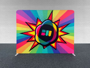
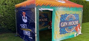
Bold colours and fonts play a significant role in capturing your audience’s attention and setting the tone for your event. By experimenting with various colour combinations and typefaces, you can create a visually appealing banner that stands out.
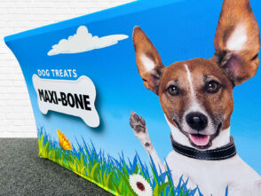
When used effectively, images can enhance your banner’s storytelling and leave a lasting impact on viewers. By incorporating high-quality, relevant images, you can effectively convey the essence of your event while capturing potential attendees’ attention.
Bold Colors and Fonts
Importance of Bold Colors and Fonts
The use of bold colours and fonts in your banner design is crucial for capturing the attention of event attendees. These elements contribute to the overall visual appeal and can help convey your message effectively. Bold colours and fonts can make your banner stand out, attracting readers to engage with your content and take action.
Successful Banner Examples
There are numerous examples of successful banners that utilise bold colours and fonts:
- A banner for a music festival using vibrant colours and large font sizes, evoking excitement and energy.
- A banner for a charity event with bold contrasting colours and readable fonts, highlighting important information and directing readers to donate.
- A banner for a trade show booth featuring a striking colour scheme and a bold, clear headline, drawing attention to specific products or services.
Choosing the Right Colors and Fonts
When selecting colours and fonts for your banner, consider the following tips:
- Coordinate your colour choices with your brand’s identity, event theme, or target audience to create visual consistency.
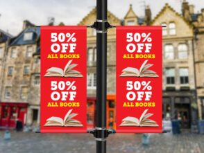
- Use contrast effectively between text and background colours to enhance readability.
- Limit the number of font sizes and styles to maintain a clean and uncluttered look. Focus on using one to two complementary fonts.
- Opt for easily readable fonts, like Sans-serif, and avoid overly decorative or complex fonts, particularly for smaller text.
- Apply bold or italic styles strategically to emphasise keywords or essential information.
To achieve a visually appealing and effective banner design, experiment with bold colours, fonts, and other formatting elements.
Eye-Catching Images
Telling a Story with Images
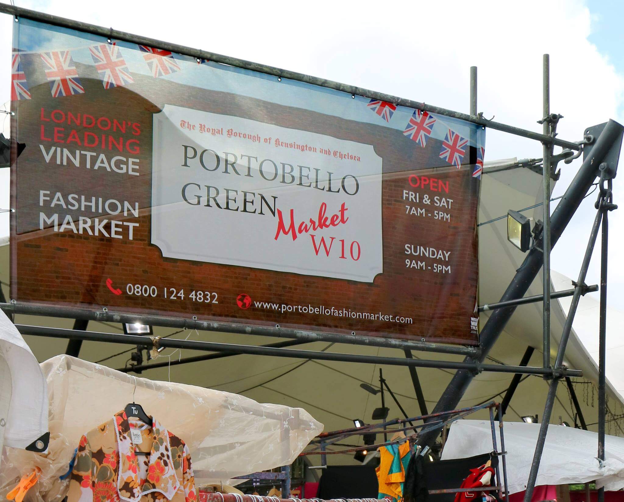
Images play a crucial role in making a banner stand out by conveying the event’s theme or telling a story about the advertised product, service, or idea. An appropriate, high-quality image can efficiently communicate a powerful message that can resonate with the target audience. While selecting images, consider aspects like the platform where the banner will be displayed, the demographics of your audience, and the central idea you want to convey.
Effective Image Use Examples
Below are a few examples of effective image use that successfully amplify the impact of the banner:
- Dynamic, action-oriented images: Use images that show people engaged in activities related to the event or product, giving a sense of excitement and involvement.
- Emotive or evocative images: Select images that evoke emotions in the viewer, making them inclined to engage with the banner and, ultimately, the event or product promoted.
- Striking, high-contrast visuals: Employ visuals with strong contrasts, as they tend to grab attention and are more memorable.
Selecting the Right Images
When selecting images for your banner, consider the following factors to ensure they complement your overall design and marketing strategy:
- Relevance: Ensure that the selected images align with the theme or idea you intend to convey through the banner.
- Quality: Choose high-resolution, sharp images with a clear focus, as they create a professional appearance.
- Colour scheme: Match the image’s colour palette with the overall design elements of the banner, ensuring consistency across all visuals.
- Audience: Keep your target audience’s preferences in mind when selecting images. Consider factors like age, gender, interests, and cultural background.
- Legal permissions: Make sure to use royalty-free images or obtain permission from the owner before using copyrighted images.
Using captivating images in banners is an essential part of effective copywriting, editing, and overall strategy to create an attention-grabbing headline that resonates with the audience. By incorporating these tips into your banner design process, you can enhance the visual appeal of your banner and make it more memorable for your target audience.
Engaging the Audience with Humor
Incorporating humour or wit into your banner design effectively engages your audience and makes your banner more memorable. Not only does it appeal to a wide variety of readers, but it also encourages social media shares and helps establish a connection between your event and its attendees. By keeping your tone light and witty, you can create a unique, personal, and fun atmosphere for your audience throughout your event.
Examples of Humor and Wit
There are many ways to include humour and wit in your banner design:
- Use funny quotes or sayings related to your industry or event theme
- Add puns, wordplays, or inside jokes
- Include comical images or illustrations
For example, a tech conference might feature banners with humorous programming jokes, while a food festival could include witty puns about the various dishes being served. The key is ensuring the humour is relevant and appropriate for your event and audience.
Adding Humor or Wit to Banner Design
To effectively add humour or wit to your banner design, consider the following tips:
- Please keep it simple: Overloading your banner with too much text or too many jokes can be confusing and overwhelming. Focus on one or two humorous elements that strongly impact and appeal to your audience.
- Maintain consistency: Ensure your humorous elements fit seamlessly with the rest of your design and event branding.
- Know your audience: Understand your event attendees’ tastes, preferences, and demographics to ensure that your humour or wit is appropriate and well-received.
By following these guidelines, you can create a clever banner design that captures attention, engages your audience, and reinforces the unique personality of your event.
Use Banners in Unexpected Ways
Utilising banners in unconventional ways can create a memorable experience for event attendees and help your message stand out among the competition.
Examples of Unique Banner Use
- Google events: At a Google event, banners could function as interactive trivia displays, engaging the target audience with questions about the company’s products or history.
- Social media meetups: Banners can be used as selfie stations or photo backdrops for social media influencers to share with their followers, amplifying your event’s exposure.
- Business conferences: Rather than simply displaying a welcome message, banners can feature an agenda, highlighting the main points and organising the event experience for attendees.
Tips for Using Banners Creatively
- Understand your target audience: Tailor your banner content to your audience’s interests or needs, making it more effective in capturing their attention.
- Leverage resources: Use various online design resources or collaborate with a professional design team to create eye-catching and unique banner visuals.
- Align with event topics: Make sure your banner content is relevant to the event theme or subject matter, helping seamlessly integrate it into the event’s atmosphere.
- Optimise for website promotion: Designs should be adjustable and easily transferable for advertising on your website or social media platforms, extending your promotional efforts beyond the event.
- Location and set-up: Strategically place banners in high-traffic areas or unexpected locations, such as floor graphics, ceiling hangings, or interactive installations, creating surprising visual elements for attendees.
Conclusion
In this post, we have presented 10 creative banner printing ideas that can undoubtedly enhance the impact of your next event. By using bold colours and fonts, incorporating eye-catching images, deploying humour or wit, designing interactive, and thinking of unexpected ways to use banners, your event can leave a lasting impression on attendees.
A successful banner design not only captures the attention of your target audience but also tells a story through visuals and text. Remember to analyse your goals and audience preferences to create compelling banners and carefully select the right images and elements that align with your message.
Optimising banners for readability and visual appeal is crucial for achieving your desired effect, so always be mindful of the elements you include in your design. Furthermore, monitoring the performance of published banners through analytics can provide valuable insights for future improvement.
Now it’s your turn to implement these ideas and watch your event take off to new heights. Good luck, and happy banner designing!




Leave a Reply
You must be logged in to post a comment.