Printed Flags are a cost-effective and eye-catching advertising medium. Flags are made to ‘fly’ and flutter in even light wind, thus attracting eye of passers-by. In this blog we offer advice on how to design your own flag.
Types of Flag
Different types of flag are used for different locations and reasons, here we point out several.
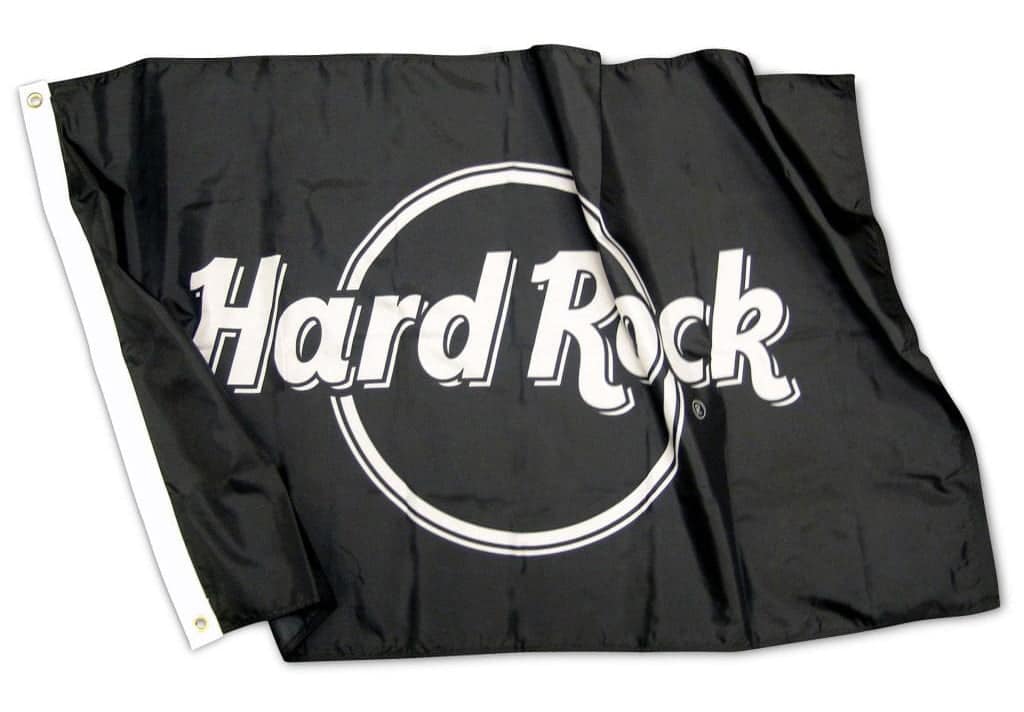
Standard Flags
A standard flag is flown from a flagpole, finished so that it can be raised up and down by pulling a rope.
On this type of flag, the design should be minimal. As they are flown high up above eye-level and will flutter in the wind, cramming the design with small text will not work.
A simple logo or crest works well to raise brand awareness.
Festival Flags
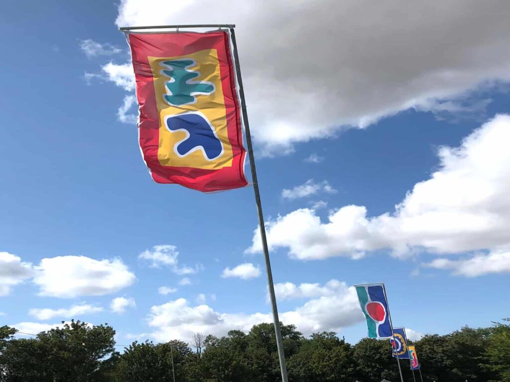
Festival Flags are typically tall flags which hang down from a supporting structure.
Again, these flags are hung high up, so a simple high-contrast design works best.
Stadium Flags
Stadium Flags have been used in 2020 to cover seating areas whilst the ban on fans is in place.
As these flags do not fly or flutter, and tend to be much much larger, more information can be included.

Crowd Flags
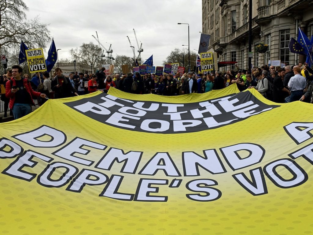
Crowd Flags are used in stadiums for fans to pass along the crowd, or by protestors on a march.
Crowd Flags usually are finished with carry handles every 1 or 2 metres to aid carrying.
Feather Flags
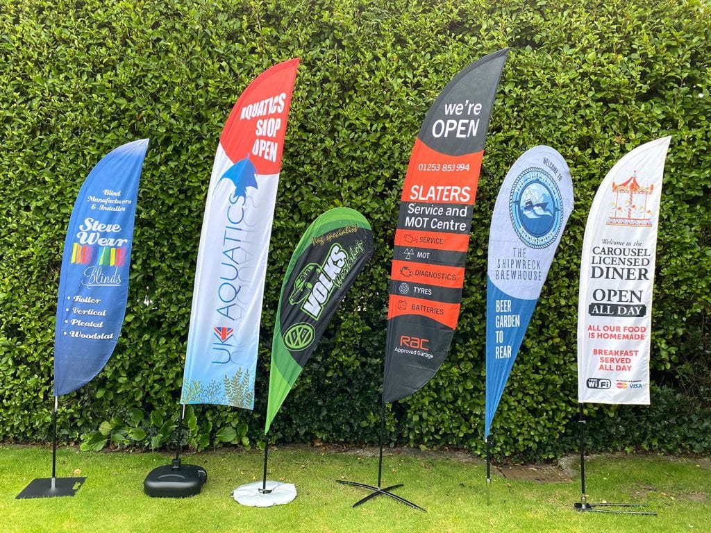
Feather Flags are also known as Beach Flags or Teardrop Flags. A flexible fibre-glass pole tensions the flag, with the pole then fixing to a base.
Feather Flags stand at up to 5-6 metres high and flutter in the wind.
Designs should be kept simple and if text is used, limit it to bullet points.
As feather flags come in set shapes and sizes, artwork templates are usually available from your printer.
The Flag Printing Process
The vast majority of digitally printed flags are made from a polyester material. Different grades and thicknesses abound, but they are all printed using the dye-sublimation method.
Dye-sublimation printing is a 4-colour CMYK process capable of high-contrast and vivid printing. Text, logos, shapes and photographs can be used in your design.
Your artwork file will therefore need to be presented to the printer as a CMYK PDF file.
The Flag Design Process
Professional designers use software tools such as Adobe Creative Suite to create artwork.
For any large-format display, vector artwork produced in Adobe Illustrator works best as it can be infinitely scaled up without losing quality. Photographs are best at 150dpi at actual size.
When designing a flag, first consider the finished size and the usual viewing distance. Any typefaces used should be clear and easy to read.
There are alternatives to using professional software such as Adobe CS. Canva is a highly popular online tool capable of creating high-quality designs.
Get your Flag size right
You can design your flag at actual size or to scale, depending on the software you use. Ensure that your final print file will scale up in proportion to the size of flag you have ordered.
Allow for Eyelets and/or Pole Pockets in your design
Ensure that no critical information is within 50mm of the edge of your flag design, this allows room for eyelets, hems and other finishing options. Background images and graphics are fine, just be wary of text, numbers and logos.
Your artwork should be set to CMYK
Set your artwork to CMYK, as this matches the dye-sublimation print process. If your artwork is in RGB mode, the colours may not come out as expected.
Colour Matching
Colour matching to Pantone references is possible, but may take longer and will incur an extra charge. Files including pantone colours will be converted to CMYK unless you specify a colour match in your order.
Design Principles
Flags are first and foremost an advertising and communication medium. Information displayed should be clear to read – consider how far away your target audience will be. If your flag is intended to be viewed from a distance then the contrast should be high and typefaces need to be legible. If you try to cram too much information onto a flag then the text may end up too small to read!







Leave a Reply
You must be logged in to post a comment.